2020 - 23 / Product design / UX & UI / Identity
Client
Prisma Learning
Info
Prisma LIVE is a custom learning platform for Prisma online school.
The goal was to bring together all the content and faciliation tools in one place freeing up teachers to focus on what matters most - connecting with kids and providing a great learning experience instead of "juggling eight different windows at once".
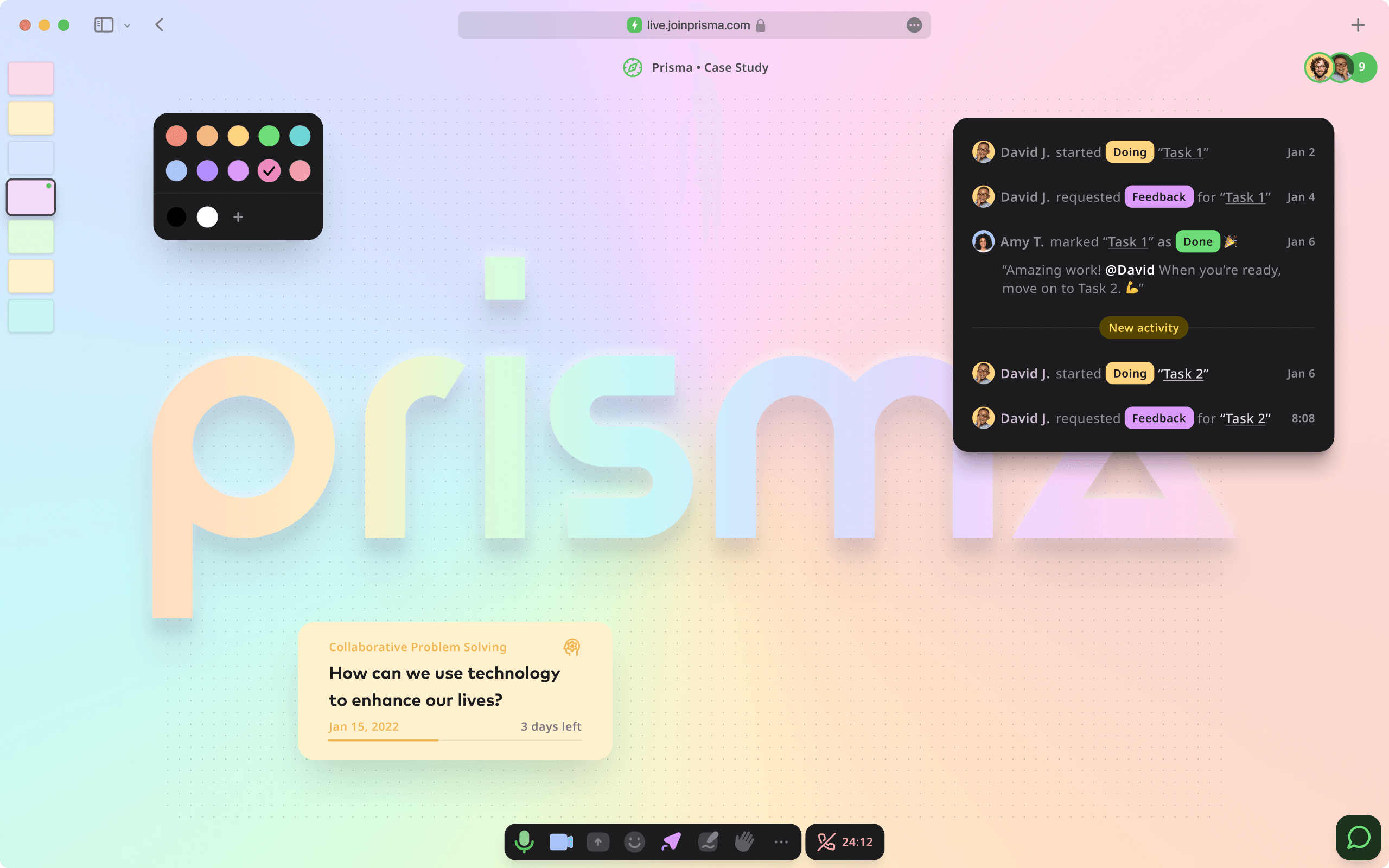
An immersive learning experience, not a stale video conference
↓
Prisma LIVE turns static lessons into dynamic experiences that alternate seamlessly and naturally between layouts and interactive elements.
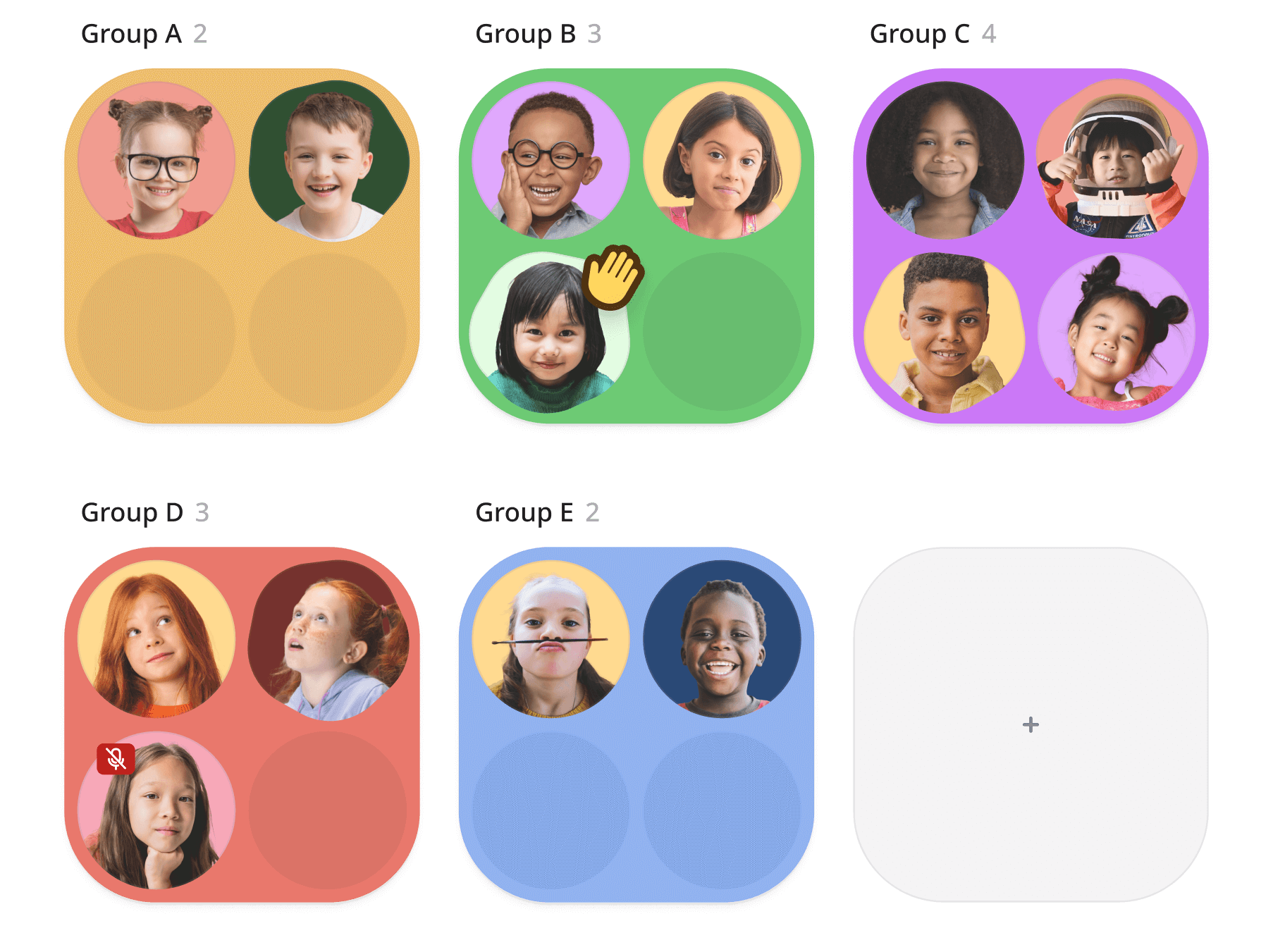
Breakout rooms that aren’t awkward
We’ve designed breakout rooms so educators can observe what’s going on without disturbing learners. No more cycling through rooms trying to understand what’s going on.
At the same time, learners have all instructions and materials right at their fingertips inside each room.
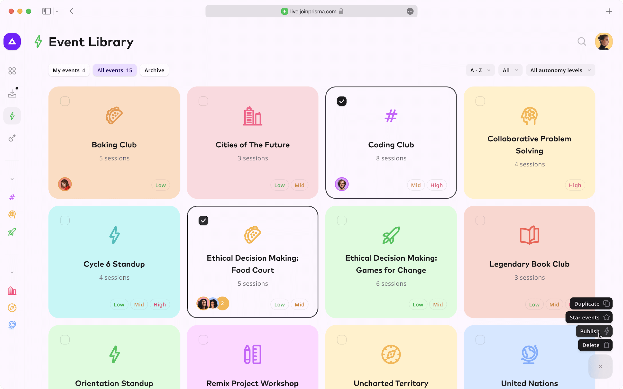
Design a meaningful live experience
↓
The editor is where live learning experiences are designed. We’ve made it performant and collaborative.
Self-directed, hard fun learning
↓
Learners complete tasks by going through feedback cycles with their mentor coach.
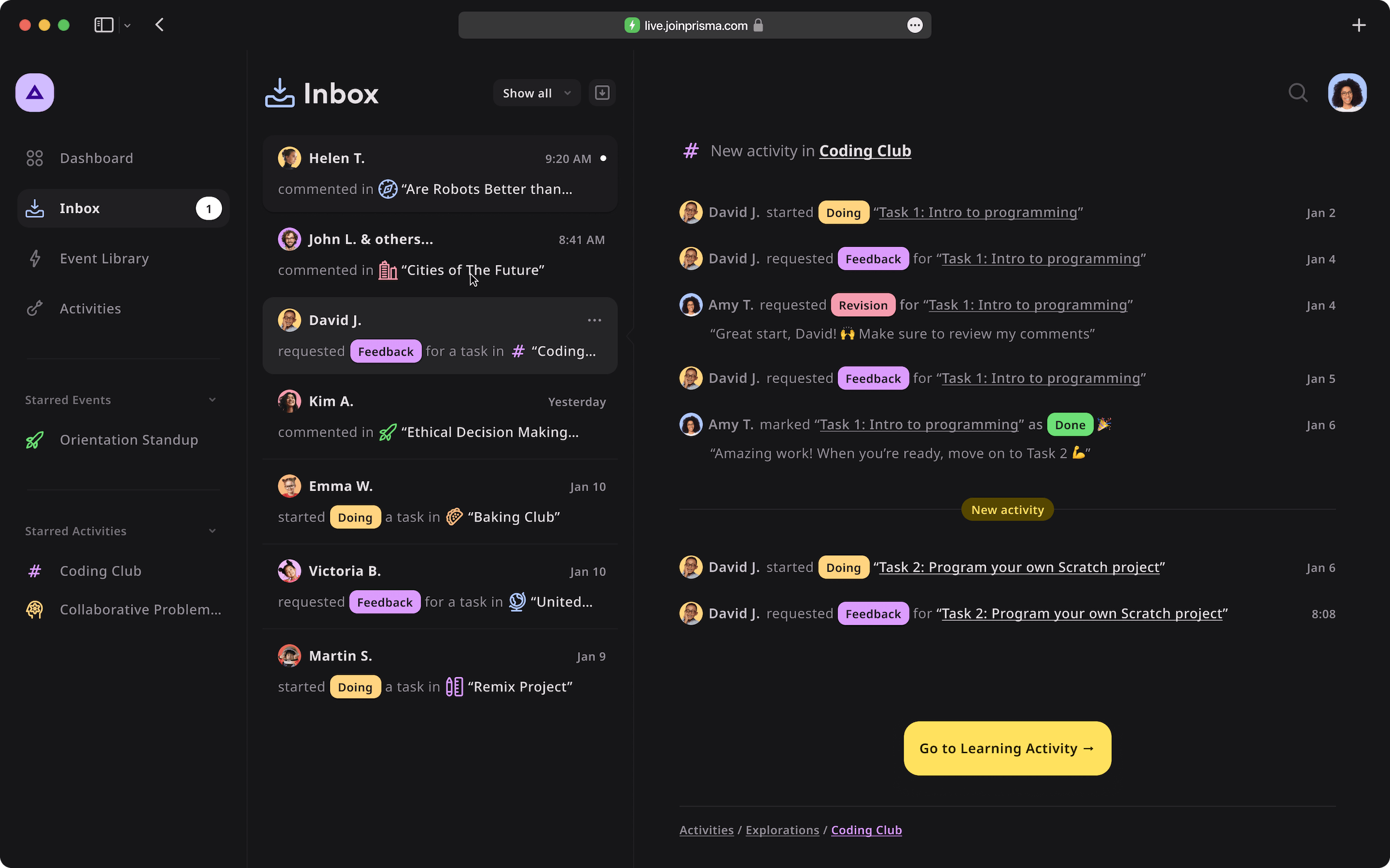
Design system
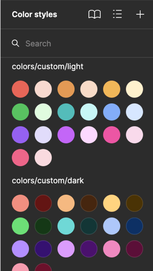
As the sole designer at Prisma, I had to find ways to keep up with the software engineers' pace. One thing that significantly helped me to speed up my workflow was using the Streamline icon library.
By fully utilizing Figma's component properties, I was able to develop a design system that is not only efficient and consistent, but also highly customizable.
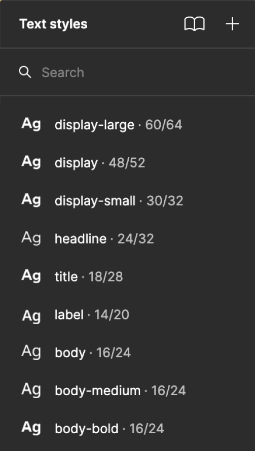
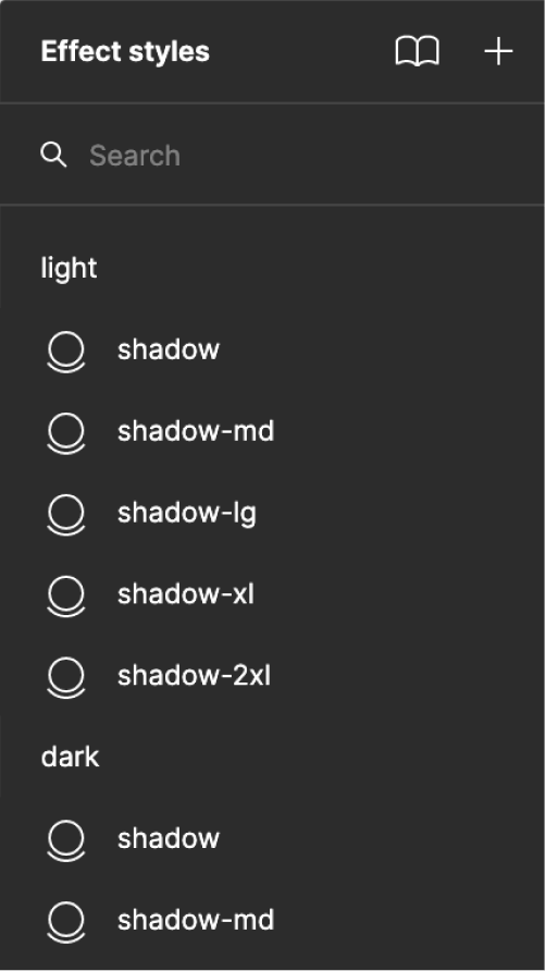
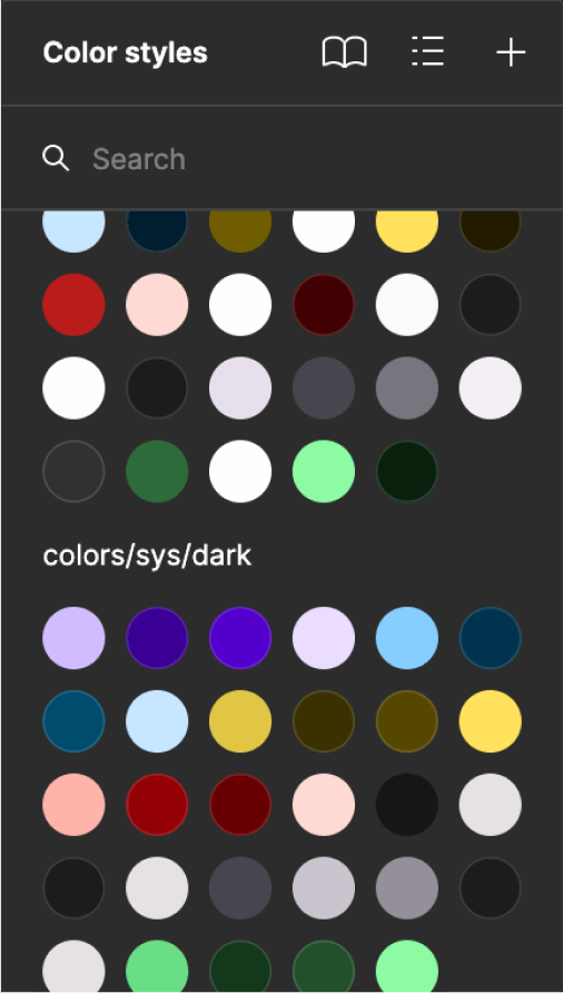
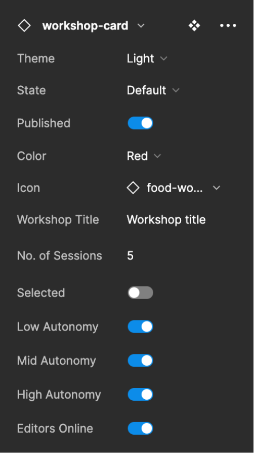
Figma’s auto layout tool helped me ensure that the design system is fully responsive.
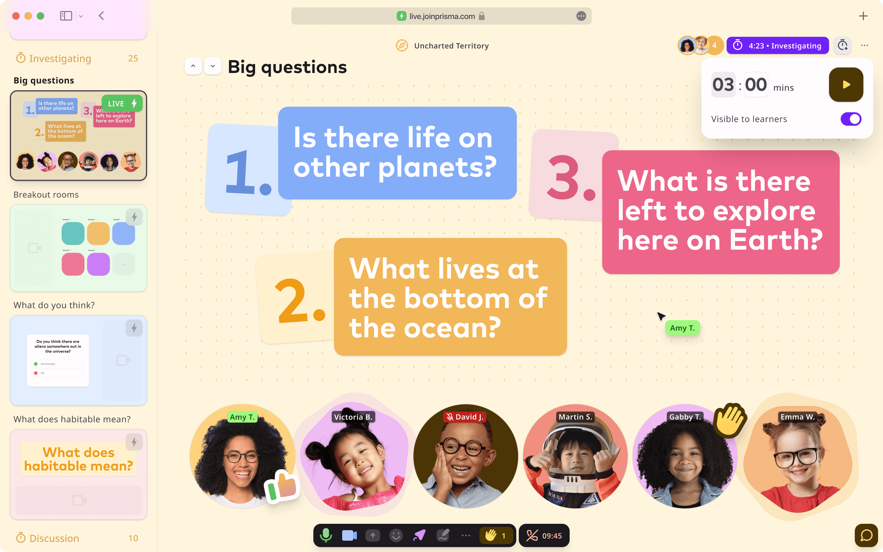
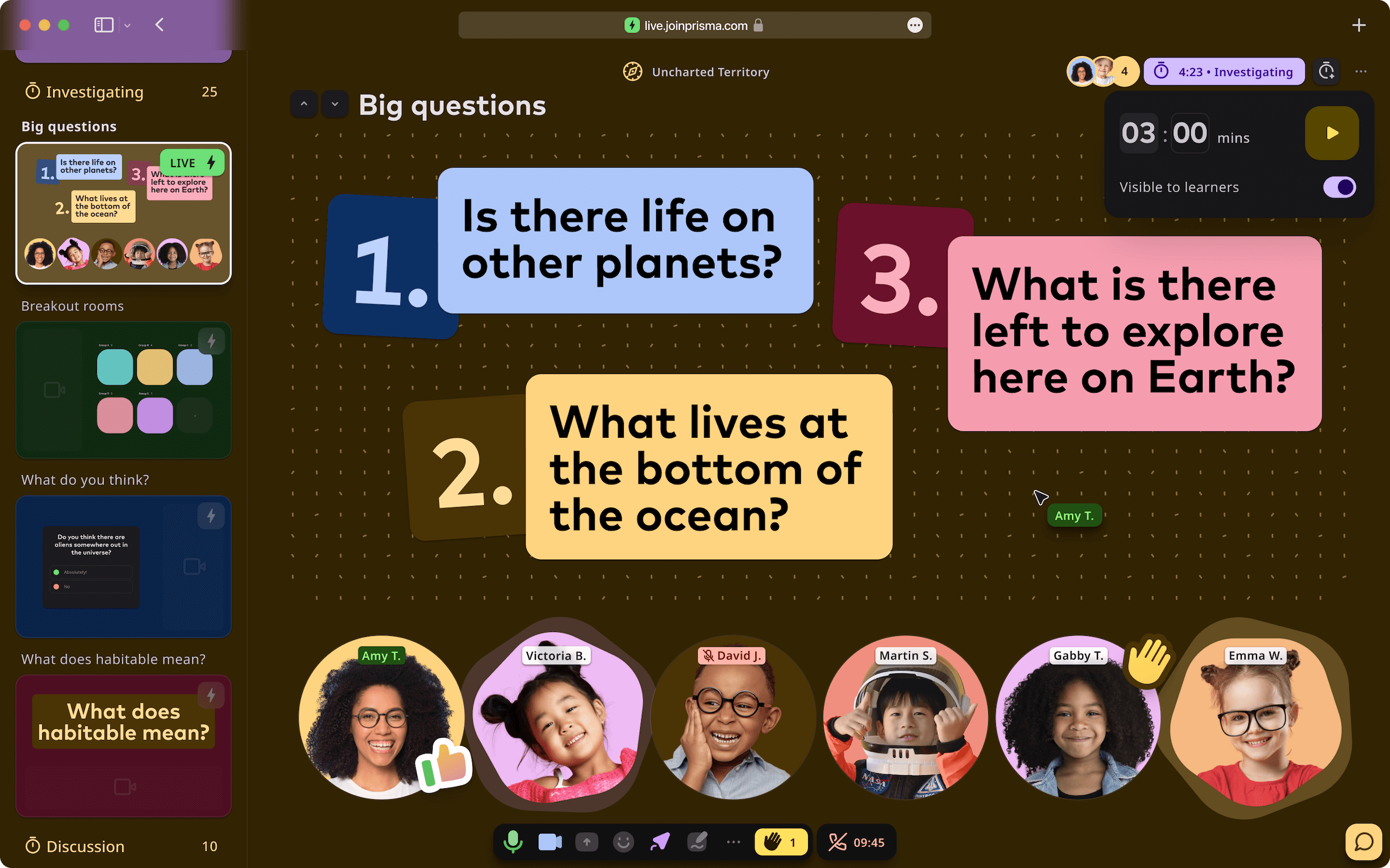
Light/dark mode
TIP: A handy plugin by our frontend wizard Javi Morales to generate and use Material Design 3 color themes with TailwindCSS.
Figma components
Skeleton loader
Prisma product team
